County, State Choropleth Map Data
In order to make maps with county or state data, you’ll need to create a calculated field from your query. Follow these steps.
- Create a query with measures you’d like to visualize along with County and State as dimensions.
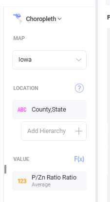
- First, choose Choropleth as the chart type:
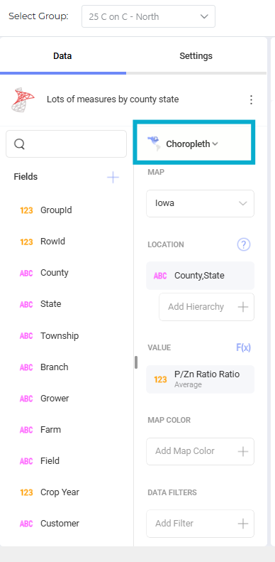
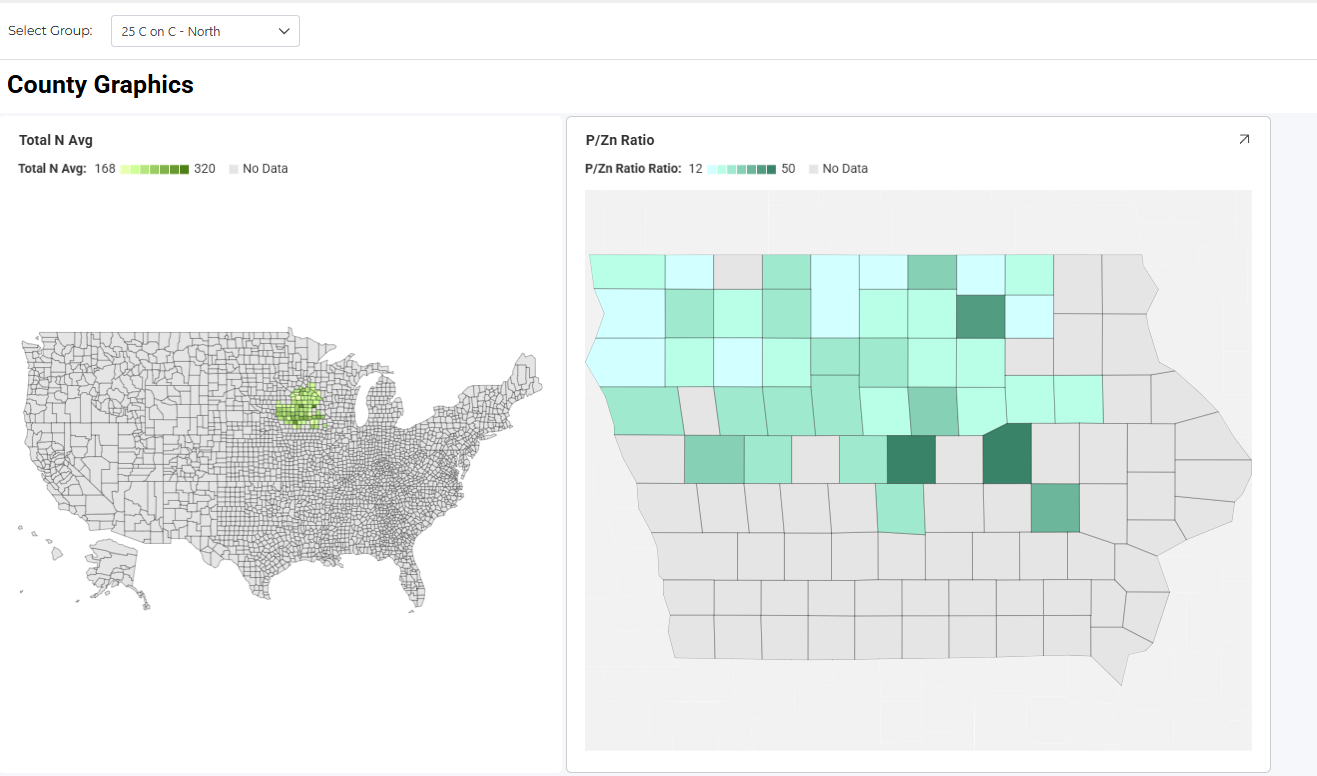
- Choose which map to use for the visualization. Selecting an individual state provides the best zoom level, as the ‘USA Counties’ option is zoomed out to the entire country and cannot zoom in, unfortunately.
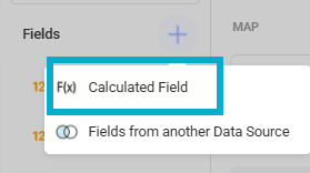
- Next, hit the plus sign next to ‘Fields’ to create a custom field, choose ‘Calculated Field’
- Name your field, then enter this formula in order to combine the data from the County and State fields in your query, separated by a comma and a space.
concatenate([County], ", ", [State])
- Save the field, add it to your visual under the ‘Location’ section. Add any value you want to visualize by county.

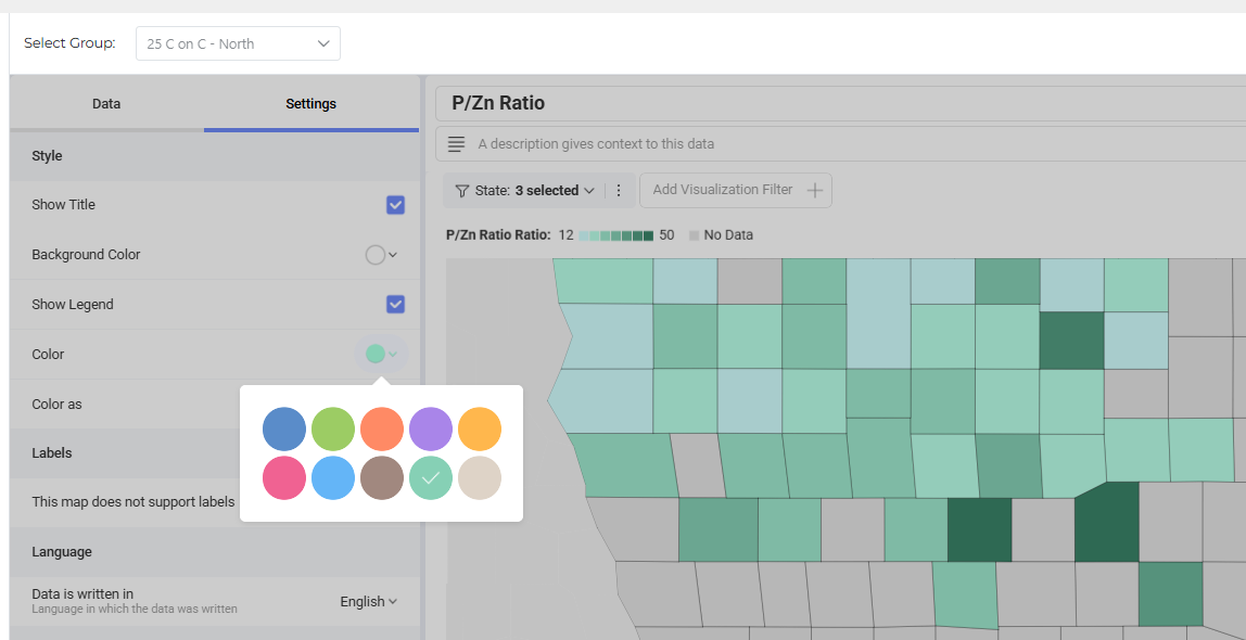
- Change colors on your map by customizing in settings