Although there is no specific way in which to use the Dashboards, this should assist you with at least getting a big picture overview!
Let's start at the Grower Level: Once you've selected your Grower, select all of their Crops, set the Selling Price, set any other filters and then click the "Economics" button.
The Economics screen will show you a few things that get the Grower interested and engaged:
You will see an overview of the Grower's Operation and any filter(s) that you have applied:

This serves as great reminder about how many acres that the Grower had enrolled and the Sale Price that you/they set to serve as a reference. Also, if there were any filters, to make sure that the data that you are presenting is what you/they believe it is and is comparing apples to apples.
As we dive into Yield Efficiency it is good to describe to a Grower what Yield Efficiency is or rather What does that number mean?

If you need another way of speaking it to the Grower, tell them to take their yield x an estimated selling price. Then, take out all of the variable input costs. Now, the number that they are going to look at is the amount of $ to return to pay for Land and Management.
If you have Growers that do not use the values from a Custom App Survey in order to give a value in Operation Costs, then make sure that you do not include them in your group or group them together. The reason for this is that the value for Operations will be MUCH higher and thus, the Yield Efficiency Score (YES) will be much LOWER!
Across the top, you will see the first three Dashboards. We all can understand the Dashboard concept, but it's best to explain it to a Grower:
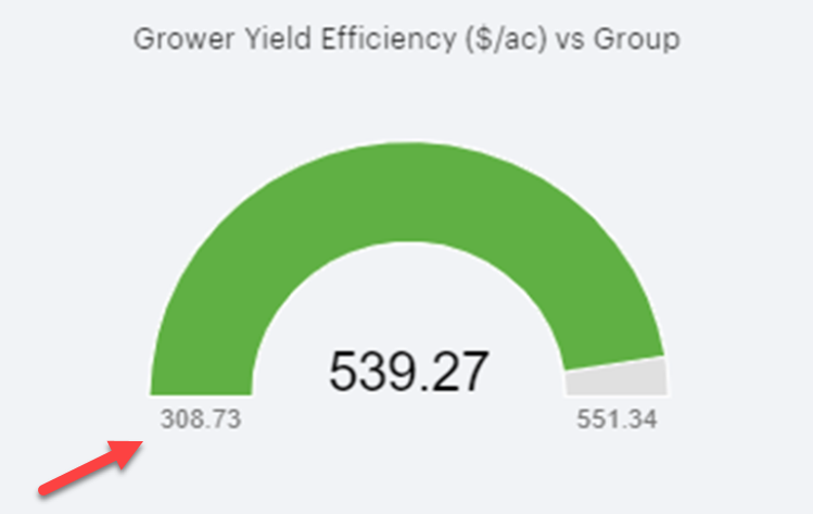
- On the left-side of the Dashboard (for any of these), the lowest amount in the group is listed:
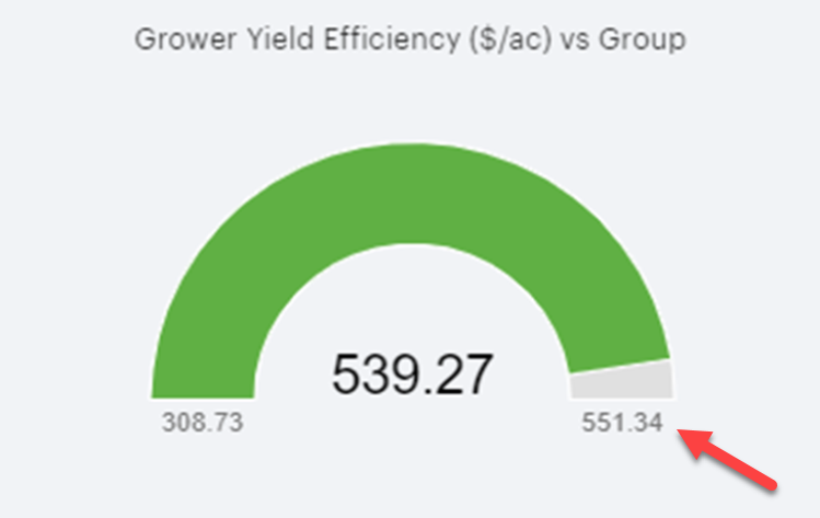
- On the right-side of the Dashboard is the greatest value within that group:
- And the middle number is the Grower's value:
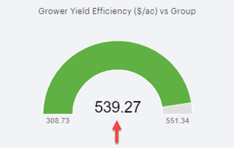
For this example: The group that we are looking at returns $308.73 - $551.34/acre to Land and Management and this Grower returns $539.27. So, from a benchmarking standpoint, this grower is pretty profitable in comparison to their peers!
Even though you have left on all crops and it's averaging yields together, you can still get some pretty interesting information!
Let's take a look at this one: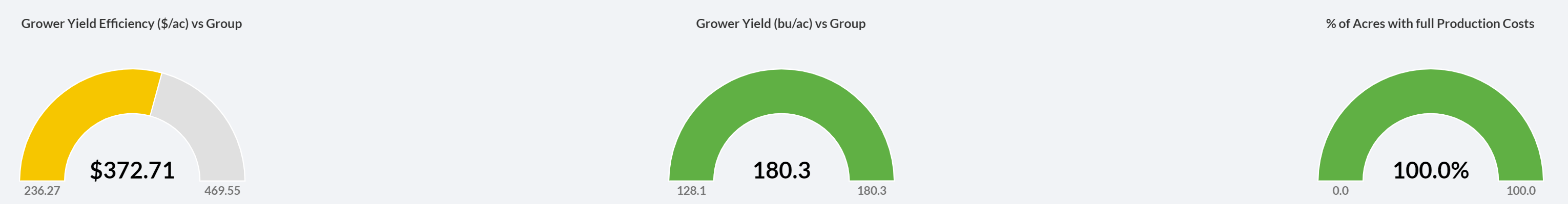
- The Grower may take a look at their Yield (the middle dashboard) and think they are doing pretty well! That's great for the coffee shop talk, but you are going to direct your focus to the Dashboard on the left-hand side.
- Some other Growers have a higher Yield Efficiency Score (YES) or in farmer terms: They are MORE PROFITABLE than this Grower!
- The third Dashboard shows what percentage has production costs in and we can see that all of the acres in this group have costs associated with them, so this is very relevant information.
Since we're all about the YES score, what are some thoughts that could be going through your head or the Grower's head:
- What are the others doing differently?
- What could this Grower be doing differently in order to increase their YES score?
Well, let's dig in!
What follows next are the categories that we break out costs for:
-
- Seed
- Fertilizer
- Crop Protection/Chemicals
- Operations
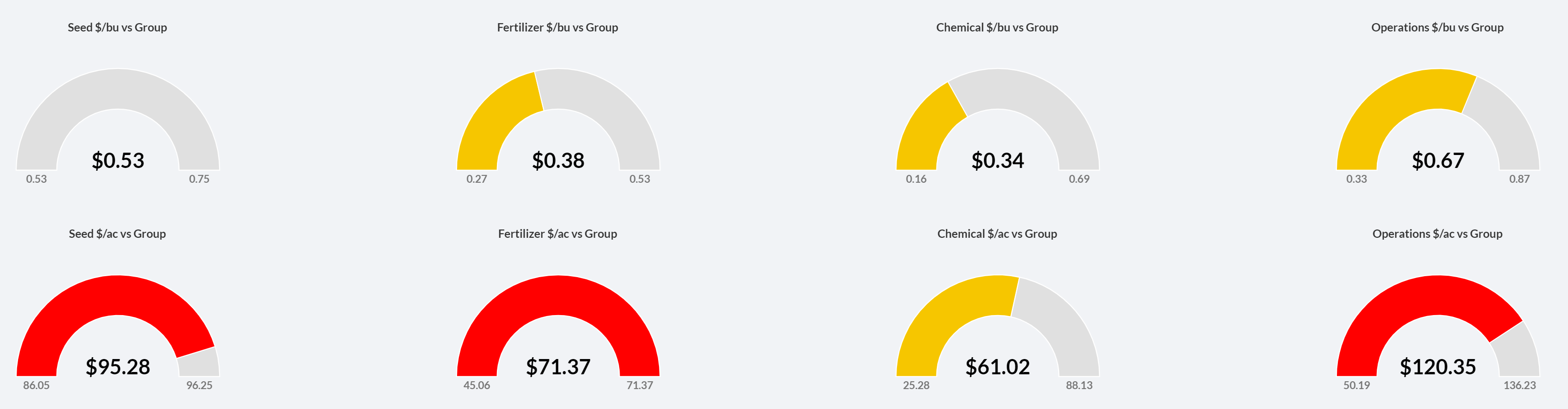
Immediately, we can see red and our eyes are drawn to these areas!
The Dashboards give you the ability to quickly have a place to start to dig into, rather than clicking around 'hoping' to find where the Grower is investing more $/acre and it may not be benefiting his bottom line.
It may help to look at ROI and the Economics Dashboard breaks it out by the 4 input categories, as well as Production & Total Cost.
However, you must understand these numbers, so let's break it down with this example:
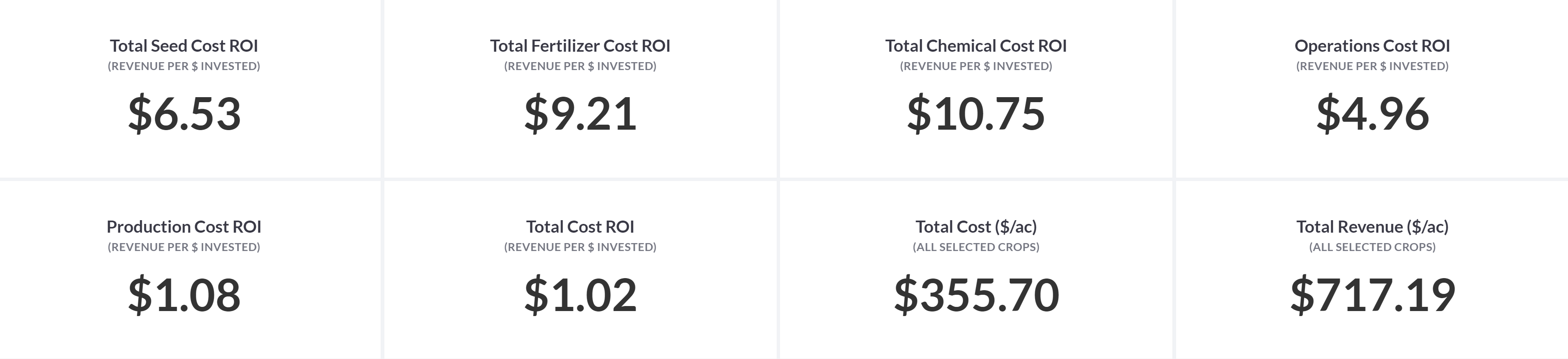
-
- Seed Cost ROI: For every $1 invested in seed, the Grower gets a return of $6.53
- Fertilizer Cost ROI: For every $1 invested in fertilizer, the Grower gets a return of $9.21
- Chemical Cost ROI: For every $1 invested in chemical, the Grower gets a return of $10.75
- Operations Cost ROI: For every $1 invested in operations, the Grower gets a return of $4.96
- Production Cost ROI: For every $1 invested in Seed, Fertilizer, Chemicals, & Operations, the Grower gets a return of $1.08
- Total Cost ROI: For every $1 invested in Total costs (would include Management & Land), the Grower gets a return of $1.02
Why you might want to include all of the Crops at this first glance is to get to these two charts:
Grower Production Cost vs. Group Production Costs:
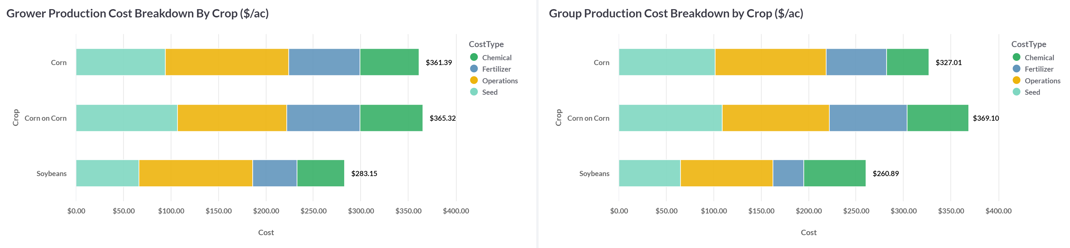
- This grower's Corn and Corn on Corn acres have roughly the same input costs in every category. However, when we compare the Group, the group spent more on Fertilizer and Crop Protection/Chemicals.
- Additionally, the Grower spends far less per acre on their Soybeans than their corn (as does the group!)
Now to put the economics to it! Let's compare the YES scores of the Grower vs. the Group:
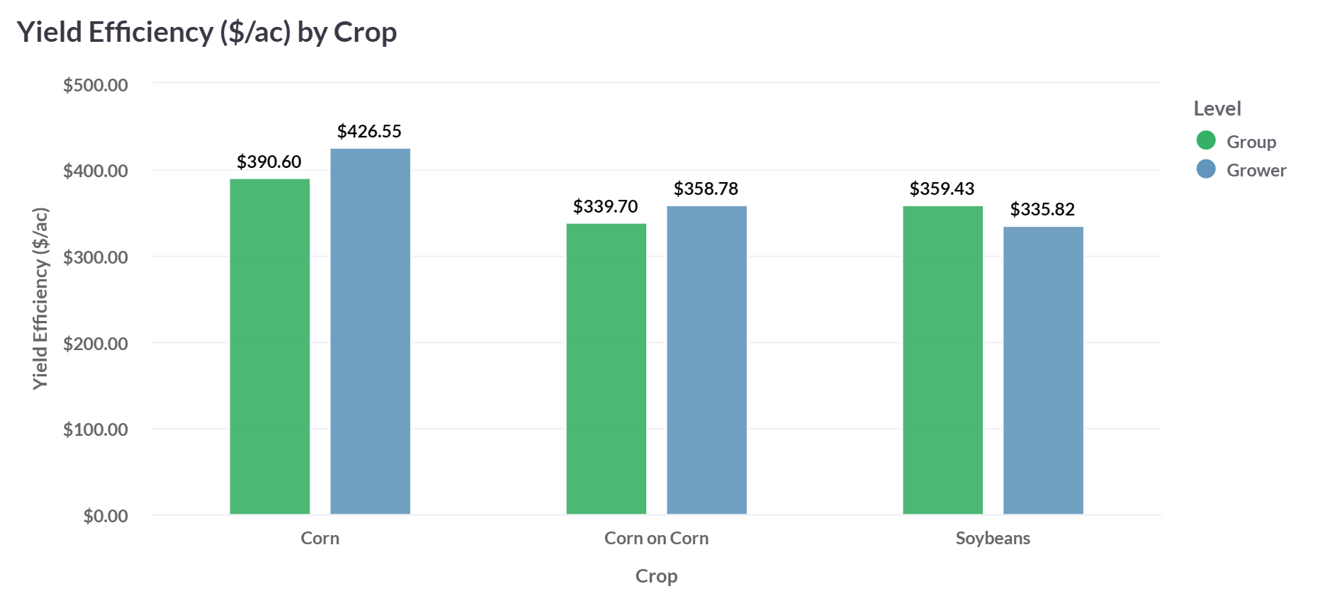
The Grower's YES scores are higher than the group in both Corn and Corn on Corn, which is great, but we can see that the are that they are not as profitable in is Soybeans!
This is obviously an example and could really be a great conversation with a Grower as far as cropping/rotational practices!
If the grower has all of their costs in (including Land and Management, you can look at the differences in the Cost per bushel broken out by the Crop(s) that are in the group and compare those against the Grower's. Even if all of those costs are not in there, it does show differences and may serve as a conversation piece!
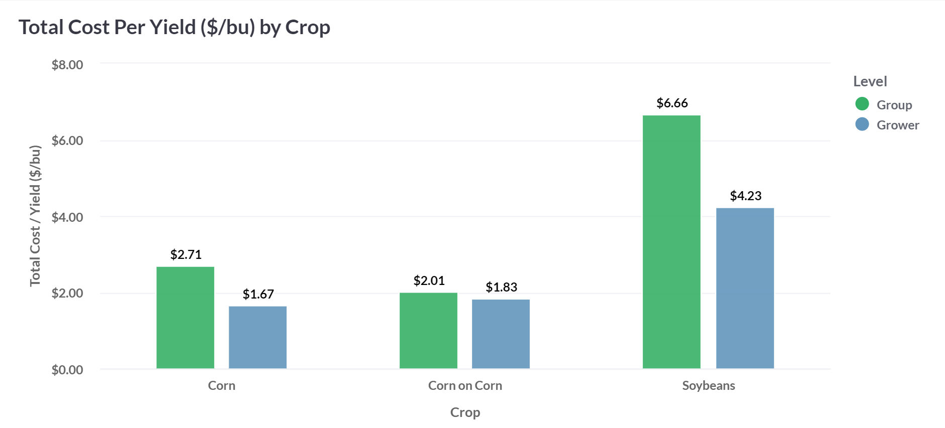
We can see that this Grower's numbers are MUCH lower than the group's. Most likely, the grower did not give you their Land and Management costs, so if they want to give that to you, now you've opened up another Benchmarking area for them to explore, as well as that $/bu map in other reports!!