- The first thing you will see in this report is the yield map broken out by the Premier 10-20 color scheme to draw attention to variability within a yield map. Also on this report will show any areas within the field that had no yield data.

- Beside the yield map, you will see a map of where the Management Zones were established, any seeding Learning Blocks, and the target population that you set within the Mgmt Zone page and what the actual or as-applied population recording in the planting file. Seeing the two maps side by side, let’s you do a quick visual check on how well the zones match up yield wise. This field is pretty good.

- On the following page, you will see what the yield was within each of your zones.

- Next comes the Average Primary Soil Test Attributes within these zones. This is a great area to at correlations to yield, but also how you can use this information as an advisor.
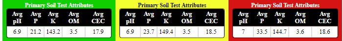
For this example, I would notice that the A Zone's Avg P levels are much lower than the B or C Zones. This is very common – consistent high yielding areas have used more P and K – resulting in lower soil test levels. Should we be even more aggressive in the A zone? The question becomes: Are we using the yield file as a part of our VR Nutrient Recommendation? Should we re-examine our fertilizing practices on this field? - The Applied Nutrients Per Acre are shown next in this report. Again, what insight can we provide to this grower to help them make more profitable decisions?
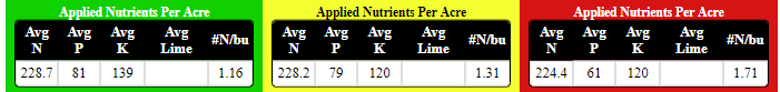
For this example: My eyes are immediately drawn to the amount of nutrients that were applied in the C Zone. Especially Nitrogen, due to its nitrogen efficiency of 1.71#N/bu. Should we start to examine our yield expectation for this area of the field and what our inputs are? - Nutrient Removals are listed, again in pounds of nutrient/actual, NOT pounds of product. Again, another great talking point with the grower about what the current nutrient strategy is on this field and where he/she may be able to use their data to make more economical decisions.

For this example: I look at what was removed vs. what was put on last fall. The Phosphorus is definitely keeping up, but could we make a different decision about Potassium? - Yield by Soil Type is next to look at the majority soil type(s) within these zones and what the Avg Yield is.
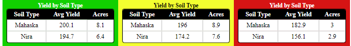
For this example: We see that Mahaska does out yield the Nira in all 3 zones, but, interestingly enough, the Nira in our A Zone out yields the Mahaska in our C Zone. This suggests that soil type is not necessarily the yield limiting factor. It’s why we don’t just use soil type when creating zones if we have more data layers. - A Yield by Actual Population table is shown next in this report. This enables you to quickly look at if your seeding rates are pretty close to optimal for this field.
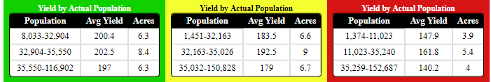
For this field, we notice that we have yield drop off both above and below the average. Although the spread in population is pretty great in the C Zone, we notice that we would give up quite a bit of yield in our B and C Zones by going higher or lower with our seeding rates. More digging into our A Zone would need to be done, due to the closeness of Yield values both above and below the average. - Yield by Variety will show the difference in yield within your Management Zones, if there was more than one hybrid/variety planted.

For this example: We could look at if one hybrid outperforms another based off of where it was placed or if it was a higher performing hybrid throughout the field. - Lastly, we look at the Average Production Costs, where all of the input costs have been rolled up into this table. Almost like a report card, it shows what our average costs were at both a $/ac level and at a $/bu level for each of our Management Zones. This helps to finally prove that Precision Ag does pay!
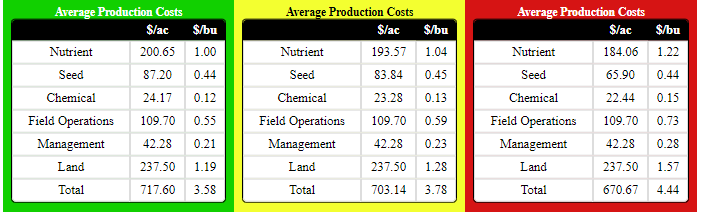
For this example: We can say that we have spent more on nutrients and seed in our A Zones, while holding back in our C Zones. With all of the other costs at essentially a flat rate, we can see that we have spent $47 more in our A Zone than in our C Zones, but our cost of production is $0.86/bu less! - What we can proudly say:
- Profitability is spatial
- If we are not managing at a sub-field level, do we really realize how much money we are either making or losing out on?
- We can use the data to changing the conversation from 'cutting costs' to increasing profitability. If we cut costs in the areas that have our highest Return on Investment, what could we then be missing out on?