Management Zones
Areas of fields have different productivity potentials. Yield maps have proven it. Treating your fields differently is key to optimizing success.
Years of Yield Maps
Some farmers have now been able to map yield for years, but there's a catch!
If we used a field's actual yields, we may have legends that would not be the same or different crops. You end up holding maps in both hands and essentially, you end up doing this:

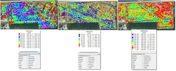
Using Premier Crop, you can use those yield files to not only visualize the differences in yields, but combine them to make Management Zones!
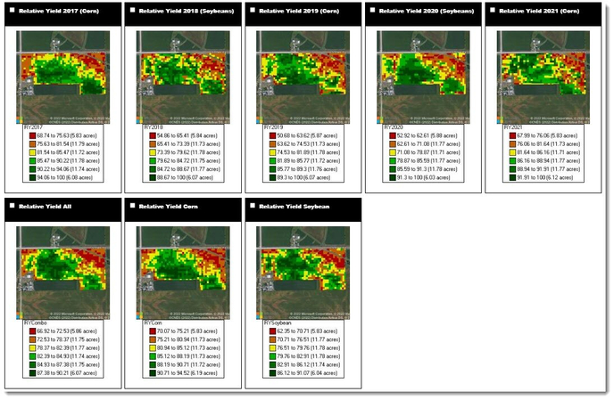
Notice the same areas, year after year continue to yield similarly?

When we combine this data, we get a map that paints a pretty good picture.
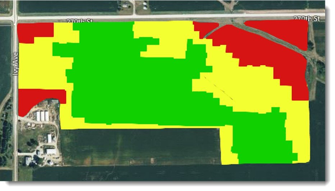
Manage Accordingly
Doesn't it make sense to push the areas in the field that yield the most to see how much they can produce?
Inviting More People to Dinner
If you were to attend a dinner where the host invited more people than they ordered food for, your plate could look like this:
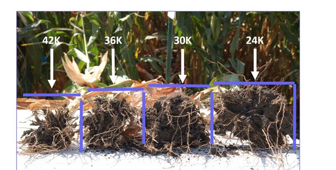
 Think of your crop in this same way....what if you only push seed populations without feeding them differently???
Manage all Inputs
Planting higher populations to push yield without feeding them, doesn't make sense.
ABC's of Management Zones
Zones have been an overused term in the agronomic world. Most of the time, it's using soil information only. Or, it could be referring to only seeding zones.
So, here's a simplified way of describing how Premier Crop describes Management Zones.

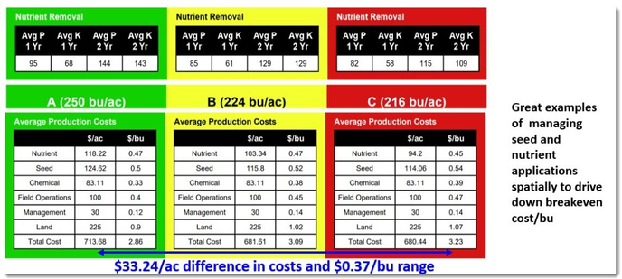
Years of data has helped to prove that we can be more profitable by doing just this! Take a look at a portion of our Field History Report:
